Freelance.nl
During this rebranding we tried to focus on connecting. Freelance.nl is a mediator, and stands between the client and the freelancer. The challenge was mainly to make these two parties central in design and story.
Corporate identity
Changing a corporate identity sometimes seems easier than it actually is. Especially for Freelance.nl, where the whole design was implemented from the printing of the pens to the advertising on the facade. To change everything at once has a huge impact on resources. That is why we have opted for a gradual transition, whereby a path has been mapped out to a complete renewal. In this way, the old can be swapped in stages and still match the new.
Animations
Publications are done on a daily basis. Using photography is then not always feasible. Therefore we chose an illustration and animation style that fits well within the corporate identity. To highlight certain features of the platform we have chosen vector animations that are loaded by means of Lottie.
Material design
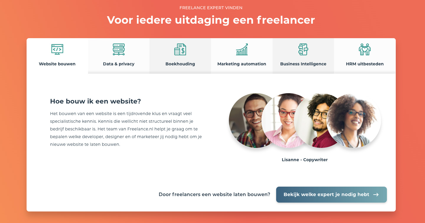
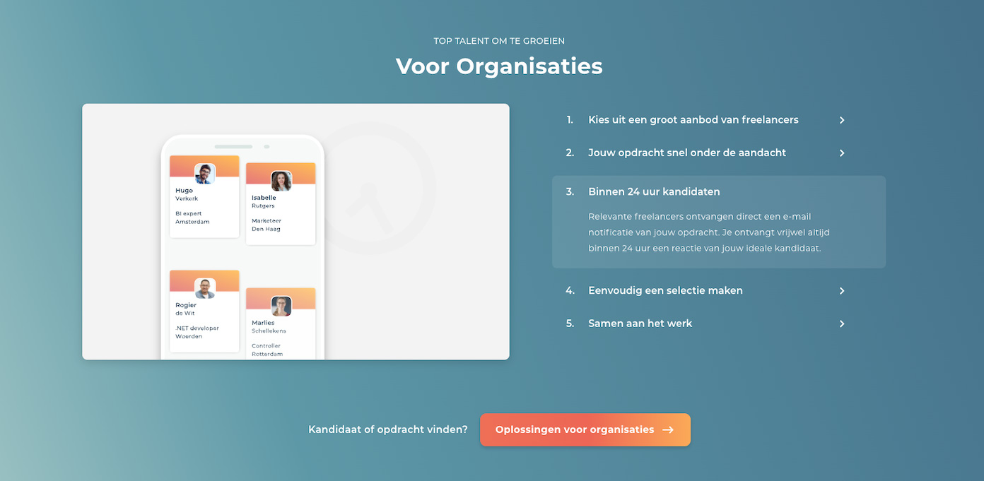
For the functional aspects we have chosen to apply Material Design. Material design has the property that it looks fresh and works clearly for the user. It also has the advantage that it can connect well with the branding, so that the functional as well as the promotional part is in harmony with each other.
Photography
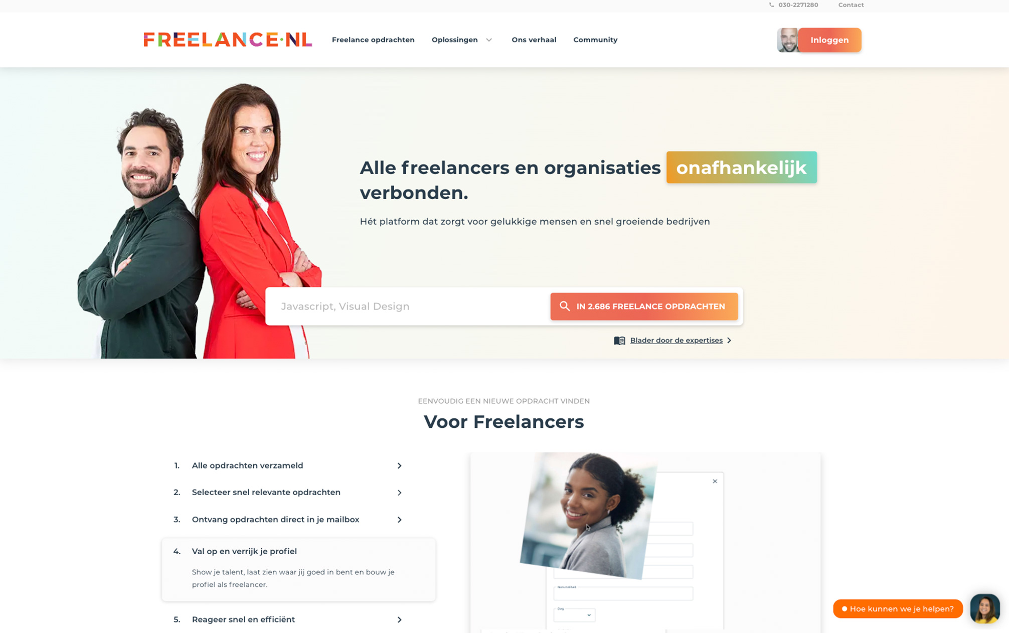
The goal of Freelance.com is to connect two parties. The client and the freelancer. We brought this out in the photography. Not just the typical white man, but a nice diverse selection of extras we chose to photograph. It should give the feeling that the platform is open to any professional.
